Bounce rate—it’s not just a number. It’s a warning sign. When people land on your website and quickly leave, it tells you something isn’t working. And if you’re trying to sell—whether it’s products, services, or ideas—a high bounce rate is the digital version of someone walking into your shop and walking right out again.
In this in-depth guide, I’m going to walk you through how to reduce your bounce rate while also selling better—but ethically. No sleazy tricks, no pressure tactics—just honest, value-driven techniques that build trust and make people want to stay, explore, and buy.
What is Bounce Rate?
Bounce rate is the percentage of people who visit a single page on your website and leave without clicking or engaging further.
A high bounce rate usually means one of three things:
- Your content didn’t match their expectations
- Your site was hard to use
- They didn’t see a compelling reason to stay
Why You Should Care (Especially If You Sell Something)
A high bounce rate is a silent killer:
- ❌ You lose potential customers
- 🛍 You miss guiding them toward your solution
- 💸 You waste your ad and SEO investment
- 📉 You send bad signals to Google
Fixing it means:
- ✅ More engagement
- 💬 More conversations
- 💰 More ethical sales
21 Actionable Ways to Reduce Bounce Rate & Sell Better (Without Being Pushy)
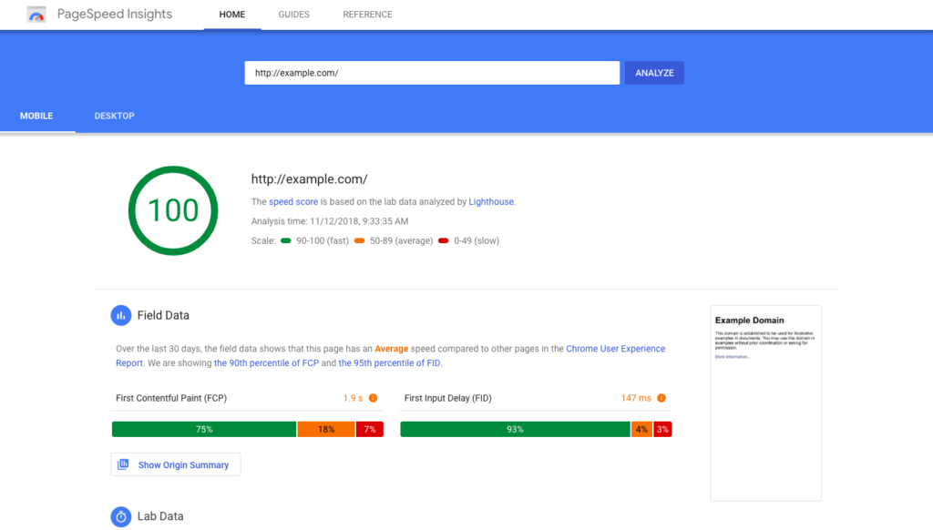
1. Speed Up Your Website
People don’t wait for slow websites. If your site loads in more than 3 seconds, your bounce rate is likely suffering.
Do this:
- Compress images
- Use lazy loading
- Choose fast hosting (like SiteGround or Cloudways)
- Add caching plugins like W3 Total Cache
2. Understand and Serve User Intent
This is crucial. Visitors come looking for something specific. If your page doesn’t deliver, they bounce.
Tips:
- Make sure your titles and meta descriptions are accurate.
- Align your content with the keywords you rank for.
- Focus on solving a real problem for your visitor.
✅ Honest selling starts with solving problems.
3. Craft Magnetic Headlines
A good headline hooks. A great one helps.
Examples:
- Bad: “Best CRM Software”
- Better: “How to Choose the Best CRM Software for Your Small Business”
4. Make It Easy to Skim
No one reads walls of text.
Structure matters:
- Use subheadings (H2, H3)
- Bullet points
- Short paragraphs (2–3 lines)
- Bold key phrases
✨ Skimmable content = happy readers = lower bounce rate.
5. Use Helpful Internal Links
Guide readers toward more value.
Example: If someone lands on a guide about email marketing, link them to a comparison of tools.
Tools:
- Link Whisper (plugin)
🔗 Suggest your best content—don’t hide it.
6. Optimize for Mobile First
Mobile users won’t tolerate clunky sites.
Checklist:
- Responsive design
- Big buttons
- Easy-to-read fonts
7. Include Ethical, Action-Oriented CTAs
CTAs aren’t just buttons. They’re invitations.
Good CTA examples:
- “Start learning today—free guide included”
- “See how we helped [customer] grow by 120%”
- “Compare plans (no credit card needed)”
❌ Avoid: “BUY NOW!!!” — Pushy doesn’t convert. Helpful does.
8. Simplify Your Design
Clutter distracts. A clean, intuitive design helps users focus.
Tips:
- Use whitespace
- Stick to 2-3 fonts and colors
- Keep navigation simple
9. Time Your Popups Strategically
Popups aren’t evil—badly timed ones are.
Use:
- Exit-intent popups
- Delay popups for 30+ seconds
- Show value (“Free checklist? Yes please!”)
10. Create Content That Solves Problems
People don’t bounce from helpful content.
How to improve your content:
- Answer common questions
- Use real-life examples
- Provide clear, actionable takeaways
11. Add Engaging Visuals and Media
Break the text with:
- Infographics
- GIFs
- Tutorial videos
12. Use Exit-Intent Offers to Save the Sale
Before they leave, offer something truly helpful:
- Lead magnet
- Discount code
- “Chat with us” option
✋ But please don’t guilt-trip or use countdown timers that lie.
13. Suggest Related Content (Contextually)
Keep the journey going.
Plugins:
- Jetpack’s related posts
- YARPP
♻️ A good blog post is a door, not a dead end.
14. Track Behavior with Heatmaps
Use Hotjar or Crazy Egg to discover:
- What people click
- Where they scroll
- Where they drop off
Then fix it. Move CTAs. Improve visibility. Remove confusion.
15. Fix Broken Links and 404 Pages
Dead ends = dead engagement.
Tools:
- Broken Link Checker (plugin)
- Custom 404 page with helpful links or search
16. Make Navigation Effortless
Confused users don’t stick around.
Best practices:
- Limit menu items
- Use dropdowns for clarity
- Add a site search bar
17. Test & Refine Everything
A/B testing removes guesswork.
Test:
- CTA button colors and placement
- Headlines
- Layouts
Tools:
18. Humanize Your Brand With a Face or Voice
People connect with people. Use:
- Team photos
- Short intro videos
- A conversational tone
19. Include Social Proof Without Pressure
Let your happy customers speak:
- Testimonials
- Case studies
- Client logos

20. Optimize Above-the-Fold Content
The top of your page should hook and inform instantly.
Checklist:
- Clear headline
- Concise benefit
- Optional CTA (without pressure)
21. Give Them a Reason to Come Back
Use:
- Retargeting ads
- Email opt-ins
- Useful content upgrades
📡 Ethical remarketing helps the right people return at the right time.
What’s a Good Bounce Rate for Ethical Sellers?
| Site Type | Healthy Range |
|---|---|
| Blogs | 60% – 80% |
| Service Pages | 30% – 50% |
| E-commerce | 20% – 40% |
| Landing Pages | 50% – 70% |
Instead of obsessing over the number, focus on improving the experience.
Final Thoughts: Keep Visitors, Build Trust, Convert Gently
Reducing bounce rate isn’t about trickery. It’s about:
- 💡 Answering real questions
- 🛍 Offering clear next steps
- 🤝 Building trust with content and design
When you do that, people stay longer. They explore. They buy—not because you tricked them, but because you helped them.
Also Read: The Ultimate HubSpot Review 2025: A Comprehensive Analysis of Features, Pricing, Pros, and Cons